We've been living with Valspar's Lyndhurst Timber since we moved in.

It's not bad, it was just feeling too heavy these days. And after 4 years, a change was in order. Here are the before pictures I hastily took right before the painters showed up.
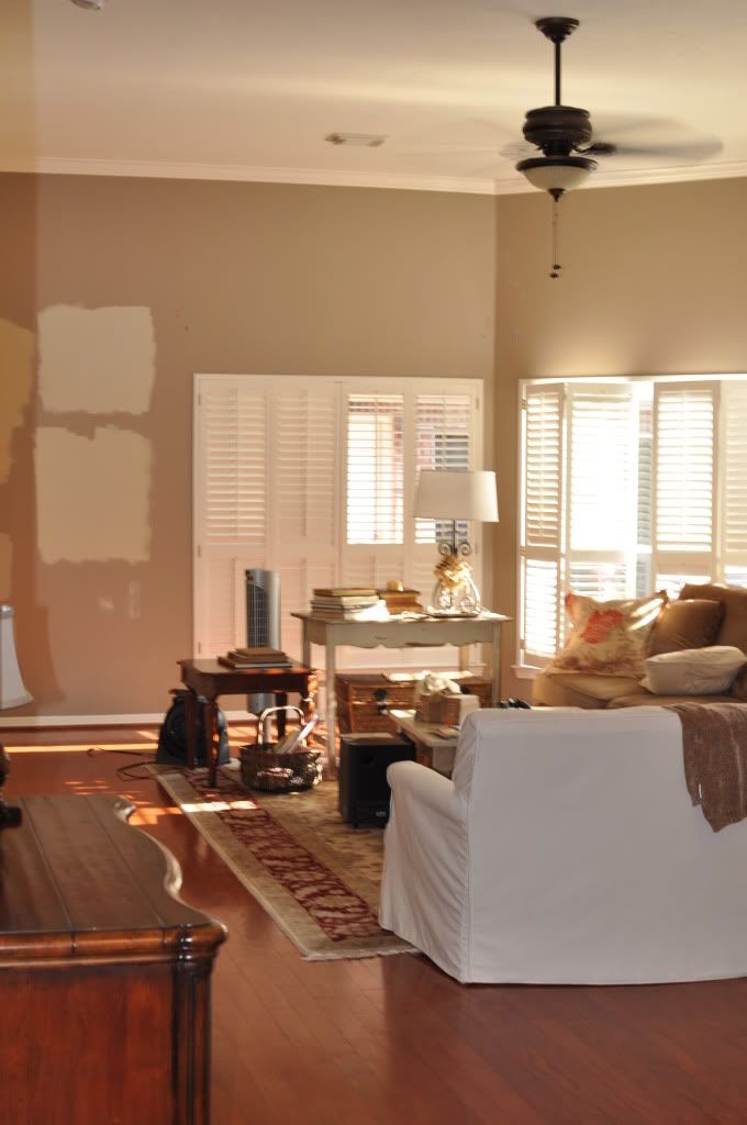
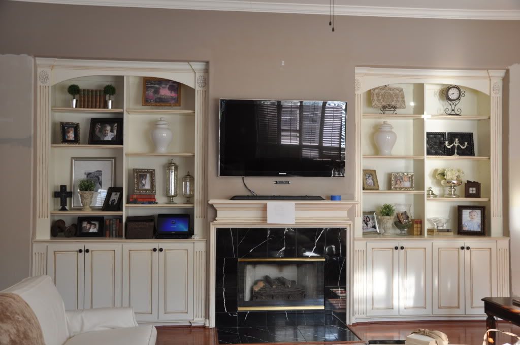
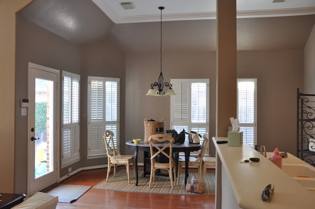
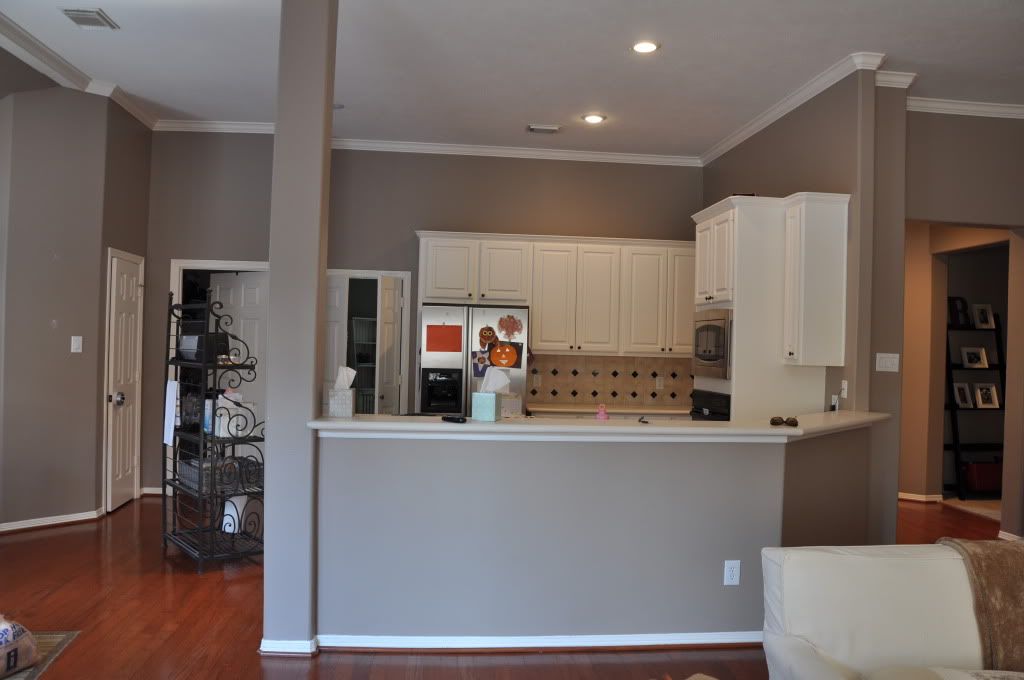
I've dreaded painting the Lyndhurst Timber because there is no stopping point between the entry/kitchen/breakfast/living room. It is a big undertaking to remove all the wall hangings, move the furniture, and plan to remove ourselves and 2 small children from the house for one night to escape paint fumes but I finally just decided to do it!
That was the easy part.
After about 12 samples from Sherwin Williams I almost gave up.
I was thisclose to using Benjamin Moore Bleeker Beige. It was one of my first 3 samples but I wasn't totally sold.....

(these pictures are really not that representative but whatever)
....so I went to Sherwie Willie for the 5th time with a sample in hand for Valspar's Oatbran. After 2 weeks, 12 samples, and patches of paint all over my walls, I needed to make a decision because they were having a 40% off paint sale. And that was going to be a big savings on 5 gallons of paint!

I wanted a grayish color that would be warm enough to coexist with all the golds, wood, and warm colors I have going on in our space. Oatbran is PERFECT! It honestly cost me about $70 in paint samples but it really is so worth it to have a color on our walls that I love, love, love.
I seriously did a Balki Bartokomous dance of joy when I saw the finished result
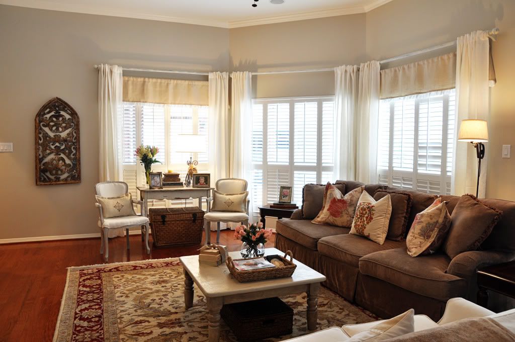
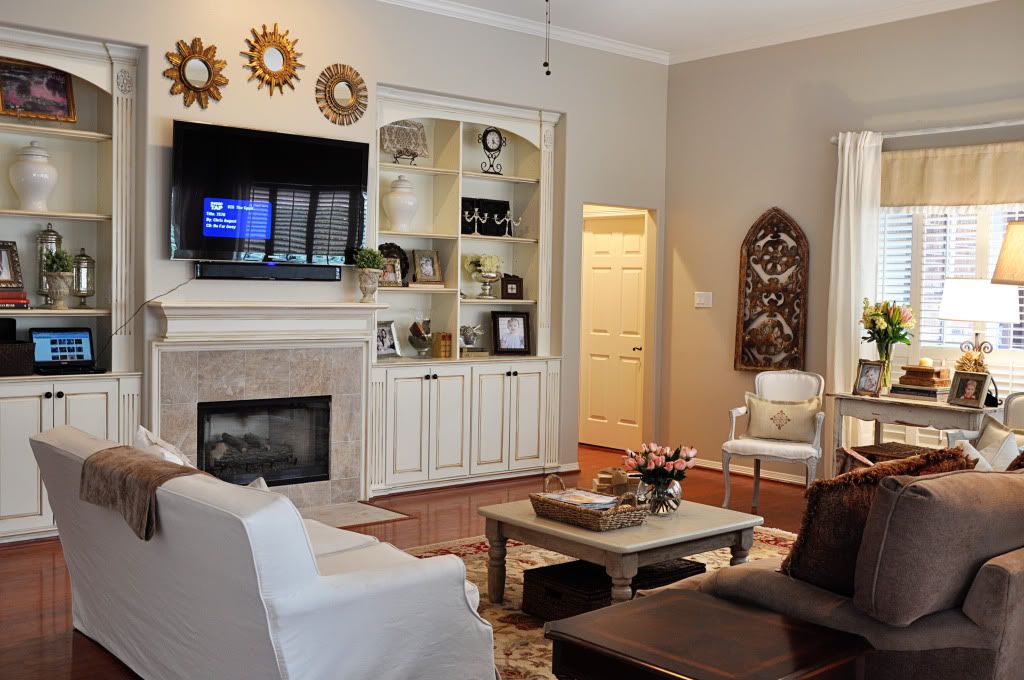
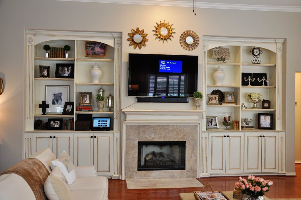
It's gray!...but it's beige!...but it's gray!
....and it changes beautifully throughout the day and evening. You can see we have lots of windows in the living room so it took a while to find a color that looked good all day and night long.
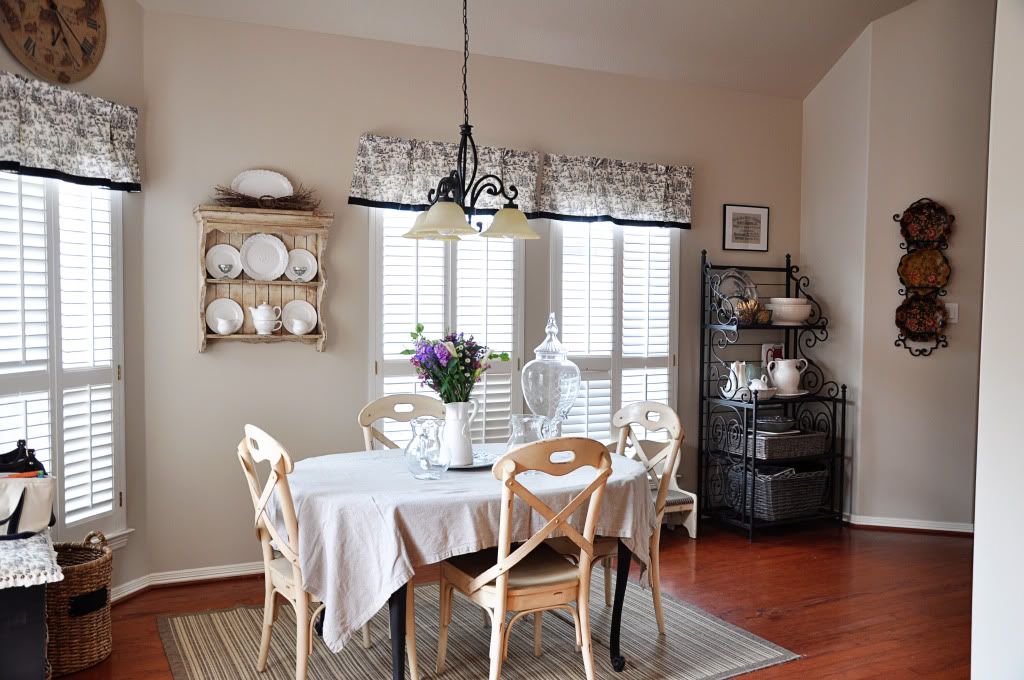
By the way, my house doesn't normally look so neat but the kids are with the grandparents for a few days and we are hosting something at the house so I've got all my fancy stuff out.
And while we're tooting our own horn, let's talk about that hideous black marble tile around the firplace. Ugh! And the gold trim....double ugh!!
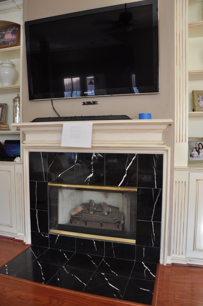
It doesn't go with anything in our house (except for the big black TV) Do you know replacing that tile was so easy? Sometimes you just gotta DO IT. Get off your booty and do something about what you don't like. It may be easier than you think.
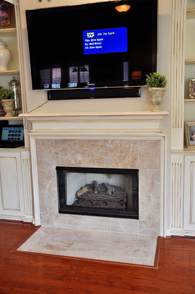
BTW: The tile is Emperador Light. It looks a little hazy because the tile man said to wait 24 hours before wiping off the excess grout. I shall do what I'm told but I had to post pictures because I couldn't wait!


















9 comments:
Hi Lori, I just found your blog and your home is beautiful! I love the new paint color and the change in the fireplace tile is wonderful. I am now a follower and I am off to browse your archives.
xo,
Sherry
Hi Lori - It looks amazing - you've inspired me to use this color throughout our kitchen/living room open concept in our recently acquired acreage home that needs serious updating! =)
Do you know whatt your trim and mantle color is? love the antique look and want to do that on my oak kitchen cupboards =)
Thanks much!
Lise
I just started painting my Living Room, Dining Room, Kitchen, etc. (The only bad thing about open floor plans is there is no good stopping place with paint.) I was afraid at first it was going to be too gray and not enough beige, but now I really love it.
Just stumbled on this and so glad I did! We have been looking at colors for our kitchen for awhile and Oatbran was one of the colors that seemed to go great with our countertops, but it always helps to see some photos of what the color looks like in an entire room. After seeing your blog I'm confident that this is the color for us. Thanks!
Hi, I know this may be a stretch but do you happen to remember which Sherwin Williams paint(Duration, Proclassic, etc.) you used and the formula for Valspar's Oatbran color? Thanks so much :)
love the oatbran! what color white did you use for the woodwork?
Thanks for posting pictures - it sealed our decision to go with Oat bran!
Very blessed to have seen this website today. I have been praying for God to help me pick out the right color for my kitchen. I wanted a beige and a gray color. We found Oatbran and decided that it was right. We haven't painted yet as the kitchen is still in the remodel phase but painting the walls is very soon. My husband said you have to make up your mind soon. After actually seeing how well it looks in your home, I'm totally convinced that it's what I want. It's a gray, no it's a beige, let's call it a greige.........Have a blessed day to all!!!
Thank you for sharing this experience. Your home is lovely! I was outside of myself and did not "pray about everything". So glad I found your blog with photos--although I'm already about $90 bucks in on paint samples. My husband laughs saying why bother with the painters when I've practically painted the whole room with sample colors!! I love this color!!
Post a Comment